
DISCOVERY
REFLECTION
Challenge

Solution

Research

Interviews
Apple’s Base Camp
Empathy Map
DESIGN

Pain points

Personas

Wireframes

Lo+Hi Fidelity Prototype

Reflection
Challenge
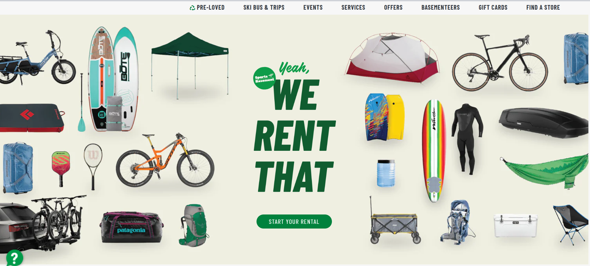
Available online camping apps and websites have cluttered designs, overwhelming amount of information, and inefficient check out processes.
Solution
Apple’s Base Camp is an app and website platform that is user friendly, provides clear navigation, and efficient check out process.
Research
To understand the user’s pain points, I conducted 5 interviews from avid campers/outdoor enthusiasts of various age brackets. This turned into empathy maps to better understand the target user and their needs. I discovered that many target users would rather shop online rather than go in-store out of convenience and comfort, and therefore, placed a heavy emphasis on being able to purchase products efficiently. However, many camping apps can be overwhelming and confusing to navigate which made purchasing items difficult. This frustrated many users.
Interviews
“I’m shy when it comes to one on one interactions and would prefer to ask questions online.” -Full-time student
“ I’d like to buy some supplies for my family so we can go camping by next week.” -Full-time teacher, father of 3 small children
“I have mobility and visual impairments making it hard to shop in-person. I would like a site that can cater to my needs.” -Retired Veteran
User pain points

Personas
Navigation
Camping apps are often cluttered in design, which result in confusing navigation

Small font on camping apps make item selection difficult, which sometimes lead to users making mistakes
Interaction
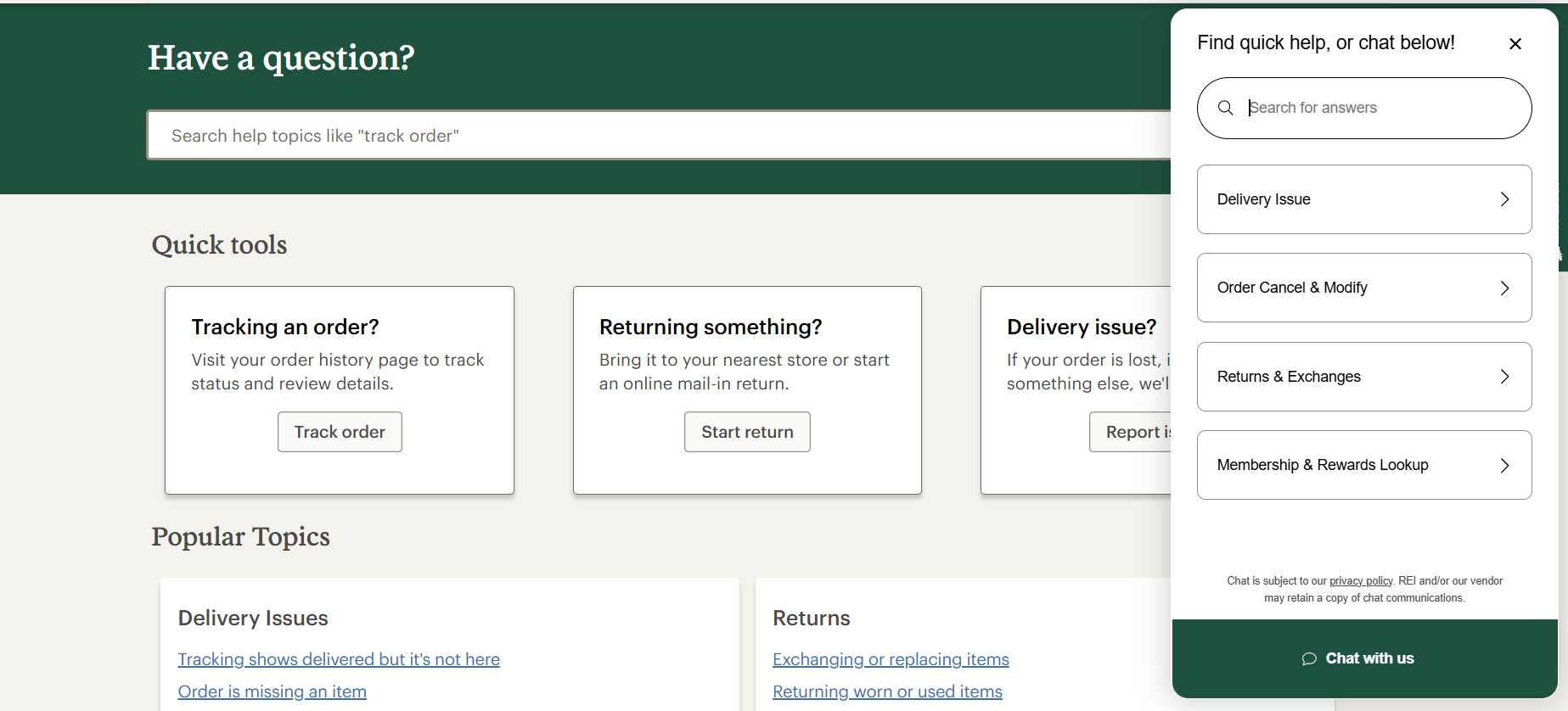
Camping apps don’t always provide live chat/help desk to provide users with information

MOBILE

Empathy map
Ideation
early sketches and wireframes
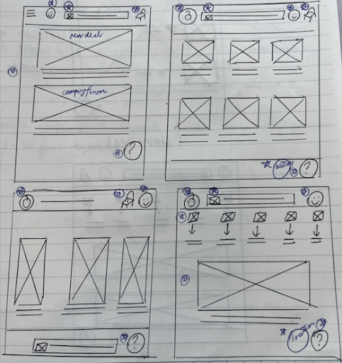
Stars indicated which element of each sketch would be incorporated into the initial digital wireframes.
MOBILE
Next I sketched out paper wireframes for each screen in my app, I kept in mind user pain points in regards to navigation, interaction, and experiences. The home screen paper wireframe variations above focused on optimization of the user’s browsing experience.
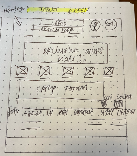
DESKTOP
Experience
Because Apple’s Base Camp customers access the site on many different devices, I started to work on designs that catered towards different screen sizes to make sure the app was fully responsive.
digital wireframes
I made sure to listen to feedback and implement them into the user flow and address user pain points. I prototyped an interaction where
users can choose and purchase a product efficiently.
MOBILE
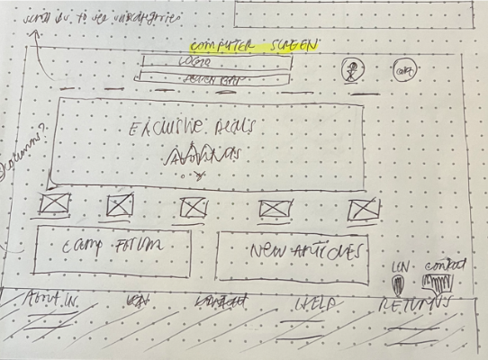
Creating digital wireframes from paper wireframes made it easier to visualize the user flow and focus in on user pain points.
Main focus was to make each screen feel uncluttered, easy to understand and navigate, with a focus on font size as well as a live chat/help desk.
Low-fidelity prototype


Refined paper wireframe
MOBILE
DESKTOP
TABLET


TABLET
From empathy maps, I was able to summarize key pain points.
Hi-fidelity prototype
After gathering feedback from the lo-fidelity wireframes, I moved into high-fidelity prototyping by refining the interface, changing typography and color palettes, and adding more accessible features. These changes help create a more polished, realistic, and intuitive experience.

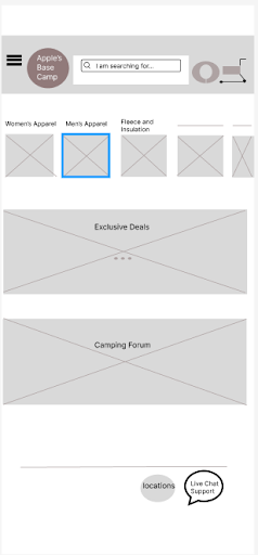
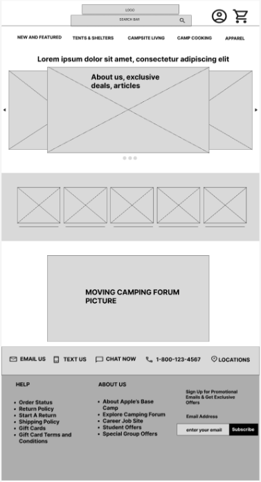
H O M E P A G E
Users can find the logo, navigation, categories, and other entry points such as “exclusive deals” and “camping forum”
Reflection
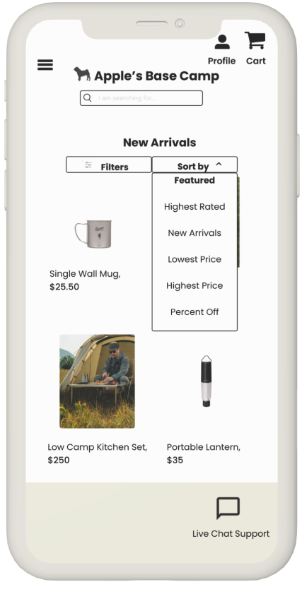
C A T E G O R Y P A G E
Users can explore and browse within each specific section with “filters” and “sort by” options

H O M E P A G E
Final prototype with adjusted layout and visuals based on feedback to make it clearer and easier to navigate
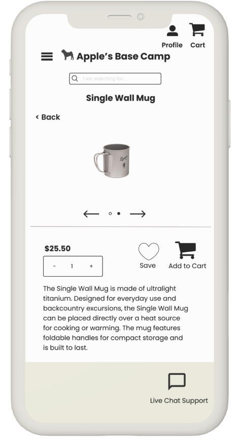
P R O D U C T P A G E
Users are shown pictures of the product along with product description and navigation to proceed with check out
Looking back at my case study, it’s been incredibly rewarding to see the project grow from early sketches to a polished prototype. Through usability testing, I learned that even the smallest details can have a big impact on the user experience. Every user is different- some might search by category, while others rely on key words or visuals. It’s important to consider the user’s perspective and be able to step into the shoes of many types of users.
Staying with the project from the beginning means you notice every little shift, every font choice, and layout change. It becomes something you know inside and out. This process reminded me why designing with care and empathy matters.