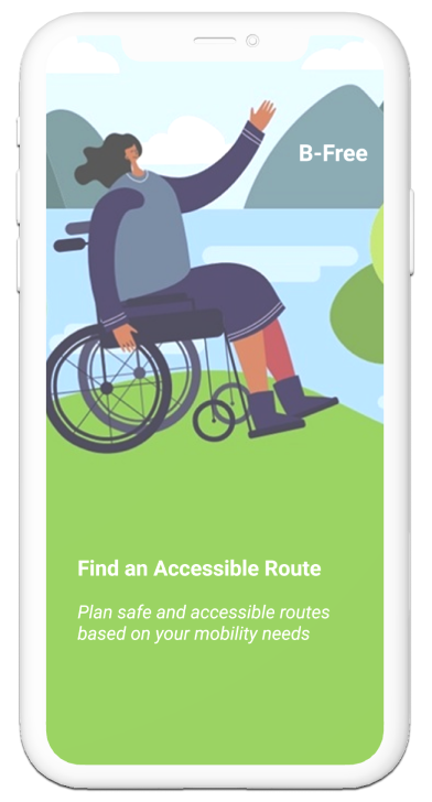
B-Free
DISCOVERY


Challenge

Solution
Research
DESIGN


Insights & Perspectives

User pain points
Personas
Low Fidelity Prototype
User Flow
REFLECTION

Sketches & Wireframes
Reflection
High Fidelity Prototype
Challenge
Many people with mobility limitations struggle to navigate in public spaces due to a lack of clear information about whether routes are accessible and meet their specific needs.
Solution
B-Free is an application that allows users to filter out routes based on specific accessibility needs such as ramps, elevators, and stairs with railings.
Research
I combined secondary research with firsthand experiences from both my personal and professional background. I explored…
Online communities such as r/Disability on Reddit
Articles and reviews of other applications such as Accessnow and Wheelmap
Observations and testimonials from my patients as a healthcare worker where I regularly interact with patients with mobility impairments (e.g stroke, generalized weakness, post-surgical), visual impairments (e.g low vision), and those in the geriatric population
Personal experiences from taking care of my father who had a stroke and my grandmother whom requires an accessible environment for daily tasks
Voices that shaped this project


“Parking any vehicle with parts of it hanging over the sidewalk. I hate having to go out into the road to get around these obstacles as it puts me at great risk of being hit.”-shared by a user on Reddit
From a conversation with my dad (a stroke survivor): “I might have to stay outside in the car because I’m not sure if there are elevators there.”-said while we were deciding whether to visit a new store
*

After his stroke in 2009, I’ve watched him navigate accessibility challenges-this deeply inspired my project.
To the left, is my dad and his best friend, Apple.
My dad’s strength and positivity have always been impactful in how I see the world and approach empathy in my design process.
Leah is a youth disability rights advocate from Long Island, who has appeared at NYFW and on Capitol Hill pushing for better healthcare and accessibility in public and transport sectors -nypost.com
“Being disabled is an aspect of the human experience that requires respect and understanding. It highlights the importance of inclusivity and the removal of obstacles, allowing every individual to realize their potential and contribute meaningfully to society.”-Leah Zelaya
Based on reoccurring themes found in my secondary research and personal experiences, I focused on three key pain points that users face when navigating inaccessible environments.
User pain points

Uncertainty about whether public spaces would be accessible to the user ahead of time
Personas
Design process
Wireframes
User interaction process
Reflection

Emotional stress when needing to adapt on the spot to an inaccessible environment

Lack of filters to specify mobility/accessibility needs when navigating routes or spaces
Inspired by communities in Reddit and my personal and professional experiences, I created personas that represent users with different accessibility needs. These profiles helped guide me in designing with empathy and intention.

Early sketches of the home screen and possible accessibility filter options the user can choose from. This helped guide the application’s overall structure and features.
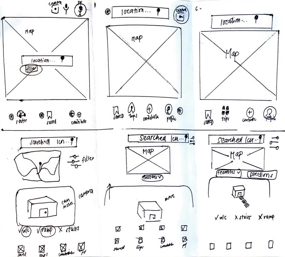
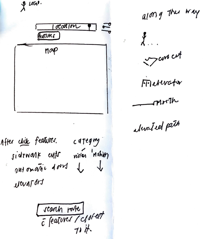
I translated my sketches into wireframes where they became the basis of the application’s overall structure, layout, and navigation.
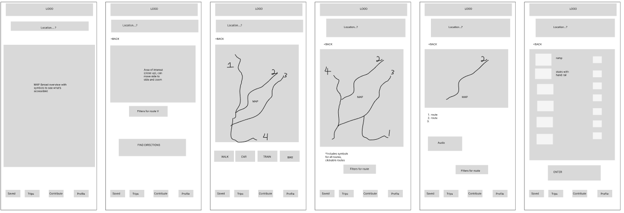
Low fidelity prototype

Final prototype showcasing the accessibility filters, which are viewed when the user scrolls down
This was my first lo-fi prototype. In order for a user to choose a route, they started at the homepage and searched for a location-> applied accessibility filters-> then chose one route from several routes recommended. I realized the flow felt a bit overcomplicated, especially the part where users had multiple steps to reach one route. It wasn’t very intuitive so I kept iterating and simplifying the experience.
High Fidelity Protoype

This was my second prototype. To help users choose a route, users started at the homepage where they can search for a location-> apply accessibility filters-> then shown a route based on their preferences. For this version, I chose to condense the mode of transportation and accessibility preferences into a single page to streamline the flow and make the experience more intuitive.
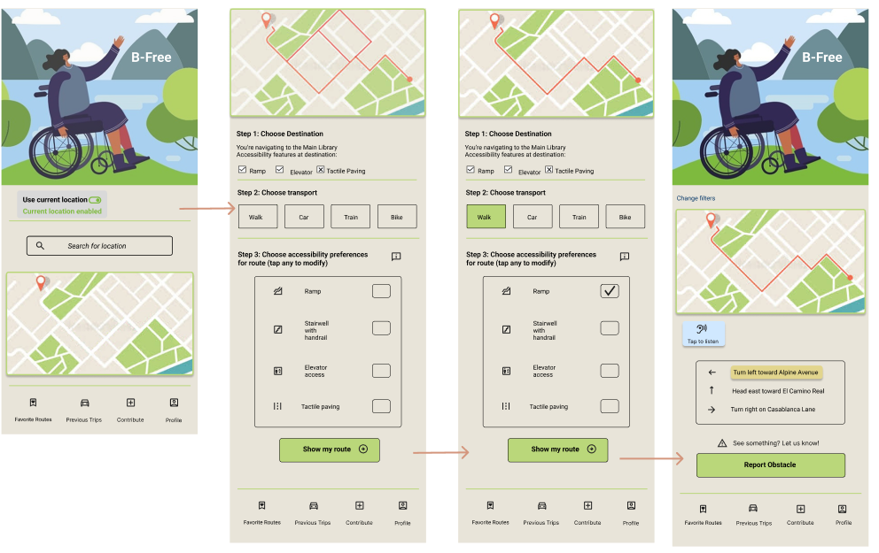


A C C E S S I B I L I T Y F I L T E R S C R E E N
This project was was especially meaningful to me because of my close relationship with my father. I’ve seen him struggle to find accessible public spaces, and at times, have to stay in the car because a place wasn’t accessible. There are so many in the community who face similar challenges, and it was fulfilling to work on this project from start to finish. It made me slow down, appreciate and be intentional with every detail- every button, every color, every clickable option.
Through this process, I’ve learned that UX design can make a real difference for the user and have a real impact on the community.
For the high fidelity prototype, I refined the user interface and improved the overall flow for better usability. Some buttons were removed to reduce clutter while some interactive features were added to improve usability. The result was a cleaner and more intuitive experience. This screen shows a user selecting “walk” as their mode of transportation and applying the “ramps” accessibility filter to create a personalized route.

